Best/Worst Comic Book Covers of January 2015
For years I’ve been picking the best and worst comic book covers of
the year. To kick off 2015 I have decided to try out a monthly feature in which I pick the best and worst covers of the month. Without further ado, here are the best and worst covers for January 2015:
Best
5. Graveyard Shift (Fran Bueno)
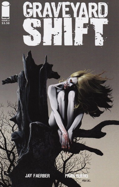
This cover gets creepy right. The background makes the mood very dismal with a grotesquely shaped tree, thorns and grey and white background. Then there's the eerie girl perched in the tree. The subtle touches on her are what really sell the cover - her blood red eyes, fangs, claws and splashes of blood all make her come off as dangerous.
4. Resurrectionists #3 (Juan Doe)
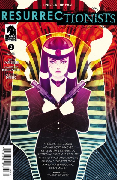
The array of colors on this cover are pleasing to the eye. The multiple layers of lines give it a hypnotic vibe.
3. Guardians of the Galaxy #23 (Christian Ward)
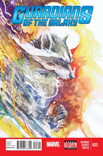
I like how this cover's painted approach looks like billowing smoke. It is a nice watercolor piece that is pleasing to the eye.
2. Rot & Ruin #5 (Alex Ronald)
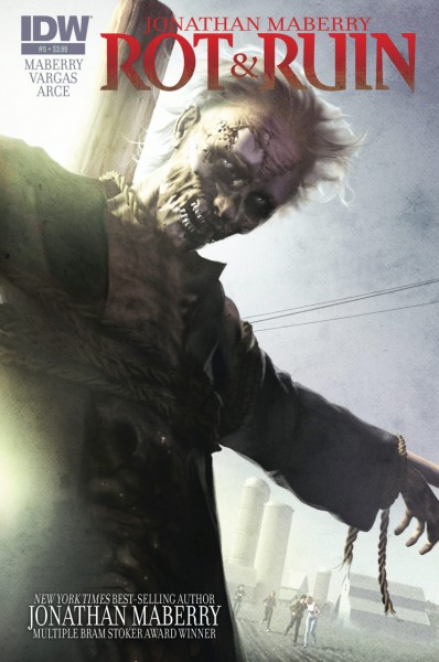
I like the subtle touches on this cover that go against the norm. It's bright versus dark. The zombie tied up looks like he's in pain rather than hungry for brains. Then there's the actual artwork which is very strong. The detail of the zombie's anatomy is great.There's even a farm with nice detail in the corner that's easy to miss at first glance. However instead of getting lazy with it, the artist actually put the effort into it.
1. Wonder Woman '77 #1 (Annette Kwok)
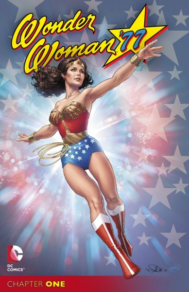
I like how Wonder Woman is drawn pretty realistically here. You can clearly see her resemblance to Lynda Carter and there's no exploitation. The background also symbolizes the character perfectly.
Worst
5. Purgatori #5 (Joyce Chin)
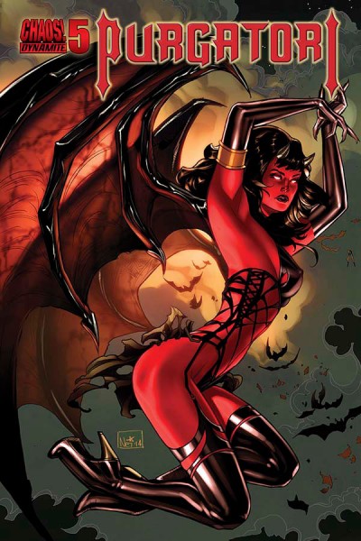
Ow. I don't know how Purgatori is comfortable with her spine, legs and arms splayed out like that. The bats in the background are also so simplistically drawn in comparison to her that they look like phony Halloween decorations blowing in the wind... yes, there are bats on this cover. What else could you
possibly be staring at?
4. The Written #1 (Art of Puro)
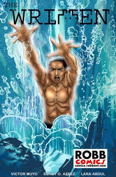
The waterfall on this cover actually isn't that bad. It's the figure that's a problem. His eyes and hair look like they're stained with the water. If the artist was trying to make it look like the water was splashing onto him he instead made it look like he was part water. If that is what the artist was going for, the numerous lines on the man's torso and his awkward expression are more than enough to keep this on the worst list.
3. Revenger #1 (Charles Forsman)
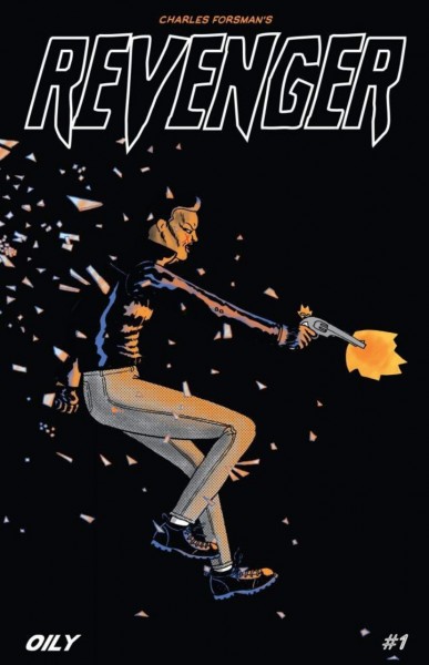
The figure in this cover seems really stiff to me. I feel like her posture would be a bit more hunched over after darting through what looks like a glass window. Her face also looks a bit scrunched and awkward but it's hard to tell with the dark background. More fluid motion would help.
2. Savage Dragon #201 (Erik Larsen)
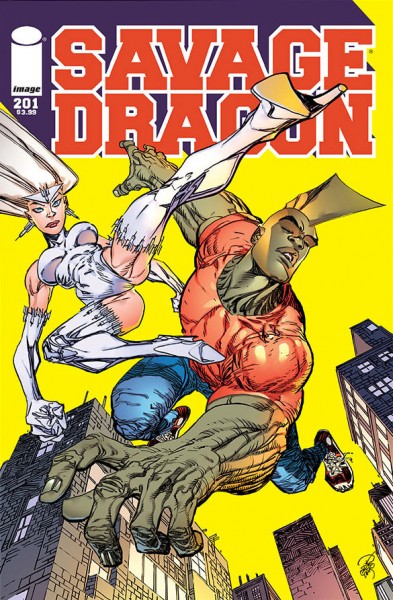
Let's ignore the blinding yellow background for a minute and talk about the almost hysterical posture of our lady in white. Her legs are spread in what fails to be a proactive pose because of how bizarre and unrealistic it looks. My legs are cramping up just looking at what was an attempt at recreating a high kick. Poor Savage Dragon appears to be sleeping to get away from this cover rather than in pain. What's even more absurd? Erik Larsen's
Savage Dragon has been on one of my annual
Best Comic Cover's features.
1. The Story of Kokoro #3 (William Thomas Gordon)
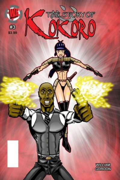
This cover makes me grit my teeth - just like the characters on this cover who are forced to show their pearly whites to the terrified audience. The background looks like it was made with photoshop effects while the character designs look like they were made with a mouse on MS Paint. The woman looks like she's off balanced and the man's chest is protruding so much that instead of the muscular look I think the artist was going for, it looks like he has breasts. Plus he has a six pack for a groin.
Your pick not on the list? Let me know in the comments below. For future best/worst cover features, if you have a cover you’d like to see chosen for being the best or worst, input your choice in the comment section. You and your choice (plus your reasoning if you want to include it) could be mentioned in future lists. The only conditions: it should be a single issue, not a collection, and the date on the comic should be for the month in question. I hope you enjoyed the first monthly edition and please let me know if you want to see more!
