Miracleman and The Dangers of Recolors
In a digital age, where coloring techniques have evolved to use a myriad of new techniques, it seems that the powers that be are just drawn to applying those techniques to the past. This sort of decisions comes out of many reasons, the most loudly touted being the impression that modern techniques can be used to "improve" or "fix" older coloring - and even lettering - methods of the past. Of course, even for comics which have had only a brief shelf date receive this treatment.
There is a feeding frenzy of sorts whenever some sort of big announcement or anniversary arrives and so they celebrate by released "remastered" works in new editions or omnibuses. It's much like the continuing releasing of "special editions" of movies - the added special features providing an allure for an altered experience. It's not that, from a technical viewpoint, the remastered artwork is in anyway subpar - although that is not to say that this is not the case here and there - but rather sometimes it has some benefits. The largest outcry over the recoloring, and this has some merit of course, is that the new editions are quite literally not the same comics that built up such a notable fan base in the first place.
With regards to comics, while a person might identify as being more of an "art person" or a "story person", it is an undeniable truth that the two are inextricably entwined when put onto paper. There is a combined effect that is placed onto the reader - a gestalt entity all it's own created in that very first instance. So, in a very real way, there is a devaluing of the very comic going on when they are messed around with. It takes away a vital part of what gave it the impact that it first had. Now while we will go into some of the more famous instances of this type of remastering, there is none more in the current spotlight as
Miracleman.
While the announcement that Marvel was finally going to reprint the series and bring it to it's long awaited close was met with joy - the idea that it would be both recolored and remastered was not. Yet, it wasn't until the actual preview pages were released recently that fears were both confirmed and wavered. In such a short time period it would appear that two distinct camps have formed surrounding the
Miracleman recoloring, one arguing that while there are places where it falters, the coloring has benefits, and those that say that it did more damage than good. To be specific it comes down to whether or not the clarity of the new colors and scans are a good thing.
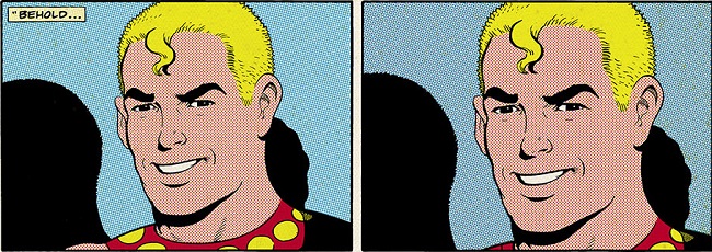
The new coloring, along with the use of original art where possible, is able to accentuate and showcase the line art. Previous editions of
Miracleman were, honestly, spotty and obscured in that regard. So while the line art can be seen with a fresh new vision, the down take of all of this is where clarity is not such a good thing. One of the most defining features of Alan Moore's
Miracleman, at least to readers who came on to the series during the Eclipse Comics era, is the beginning prologue - a warped take of the original Mike Anglo stories. There is a crude whimsical nature to the coloring in the Eclipse comics, like a worn, moldy, keepsake from a bygone era. Kitschy, yet full of youthful exuberance. The new Marvel coloring gives it the same coloring as the rest of the issue, going by the preview glimpsed above.
There is just a flat transition - there is no transition at all in fact. The same palette follows along, so while the line art of the sequence hearkens back to the past - the coloring has lost that raw, crude, power. As stated previously, it is this last type of remastering, that has not been uncommon and that most readers find offensive. The loss of raw power, this diluting of effect, was also the bane of another recent recoloring - that of Grant Morrison's trippy masterwork
Flex Mentallo: Man of Muscle Mystery. However, this is a complicated within itself - as it goes far beyond editorial meddling.
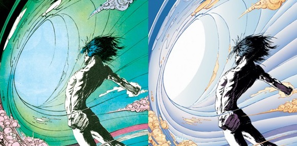
A lot of the recoloring that was done for
Flex Mentallo was to bring it more in line with Morrison's original ideas for the series - things such as the "imaginary world" being in a state of perpetual night time. Yet it was in original colorist's work that there was a fuller emphasis of the rather golden/silver age love letter that the series is commonly and warmly remembered for being. While the recolor brings out a thematic quality to the artwork, one that was definitely missed beforehand, but it lost the zany, popping, Technicolor vibe that accentuated it’s more mindbending aspects. It opens the doorway for this whole “death of the author” but applied to comic creators.
The most impacting example of the above is perhaps the recoloring of Alan Moore’s
The Killing Joke for its DC Deluxe Edition. The original coloring was an intense mish-mash of contrasts, intense hues, and vibrant neon. It was a great compliment to the ideas inherent to the story, which of reaching into what was claimed to be a layer of the Joker’s mind. Could one expect any less than the slap the face the colors provided? Artist Brian Bolland supervised the recoloring, hoping to create a more subdued and drearier tone – using more realistic colors to ground the crazy nature contrasted by stark reality. Yet, in going for original intent, which makes or breaks the comic?
There are strengths to each type of coloring styles, especially in hindsight and when a creator can look back and think of what to improve. The border is created by first exposure, personal preferences, and really how one actually thinks about and balances out the pros and cons of what is put into the coloring. Of course, if they released special editions separately this might not be such a big deal but where would the coin be in that? How do you, the readers, feel? Any thoughts and comments would be appreciated below.
