After a pretty successful mini-series that had the fans of the futuristic Neo-Gotham asking for more, the first issue of the new on-going series Batman Beyond is a bit of a disappointment. If you're reading some of DC's other Batman titles you may want to stick with those, though the series could show signs of improvement; if they fire the artist and start focusing more on Batman.For those unaware of the Batman Beyond history, Terry McGinnis works with a now old and retired Bruce Wayne as the new Batman. This new series takes place after the short Batman Beyond mini-series featuring Hush. After neglecting his family, Terry is finally making time for everyone, but faces a dilemma when his mom and brother face a very hostile situation. The rest of this issue features Carson Jatts, a worker at Justice League headquarters that learns he is dying and is now out for revenge.Adam Beecher writes the first story arc and leaves a lot to be desired. If you were looking for more of a focus on Batman you are not given one. You only see his narration once. The rest is from Jatts. He has the potential to be an interesting villain but his story is far from original. And when I picked up Batman Beyond I wanted more from Batman's point of view, not a villain that has only just appeared. And while it's nice to see the new Justice League right off the bat, it takes even more attention away from Batman. There is also little to no action.Ryan Benjamin's art is even worse, and I was surprised to see such an anticipated title given such poor quality art. On the second page Batman looks impish with his pointed ears and nose. He looks fine on the cover, but these mistakes are made throughout the comic with him – though we only see him in his costume twice anyway so it's not too noticeable. The rest of the characters suffer problems also. They looked oddly warped and Bruce Wayne has so many wrinkles it looks like he's been through World War 3. The colors are in keeping with the upbeat tone of the comic, but make it seem like more of a Saturday morning cartoon rather than a comic book. Sometimes the eyes are pretty to look at, but that is all the art has to offer. I recently stated in my review of Batman and Robin #18 that the only reason to read the comic was because of the "Absence." This happens here as well. If you are not that interested in Jatts you’ll spend a lot of time hoping to see Terry in action. You won’t find it. This comic definitely has a lighter mood. So if you’re into the darker Batman, you should not be reading this. If you are a fan of the cartoon or the mini-series you may like it, but I’m still wishing I’d spent my $2.99 on a different DC title. Story - 5.0Characters - 5.0Art - 3.0Colors - 6.0Overall - 4.7
An all-around nerdette, I’m a comic book connoisseur, horror aficionado, video game addict, anime enthusiast and an aspiring novelist/comic book writer. I am the head of the comic book department and the editor-in-chief of Entertainment Fuse. I also write and edit articles for Comic Frontline. I am also an intern at Action Lab Entertainment, a comic book publisher at which I edit comic book scripts, help work on images in solicitations and help with other comic book related project. My own personal website is comicmaven.com.
 Adam Beecher writes the first story arc and leaves a lot to be desired. If you were looking for more of a focus on Batman you are not given one. You only see his narration once. The rest is from Jatts. He has the potential to be an interesting villain but his story is far from original. And when I picked up Batman Beyond I wanted more from Batman's point of view, not a villain that has only just appeared. And while it's nice to see the new Justice League right off the bat, it takes even more attention away from Batman. There is also little to no action.
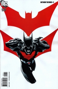
Ryan Benjamin's art is even worse, and I was surprised to see such an anticipated title given such poor quality art. On the second page Batman looks impish with his pointed ears and nose. He looks fine on the cover, but these mistakes are made throughout the comic with him – though we only see him in his costume twice anyway so it's not too noticeable. The rest of the characters suffer problems also. They looked oddly warped and Bruce Wayne has so many wrinkles it looks like he's been through World War 3. The colors are in keeping with the upbeat tone of the comic, but make it seem like more of a Saturday morning cartoon rather than a comic book. Sometimes the eyes are pretty to look at, but that is all the art has to offer.
I recently stated in my review of Batman and Robin #18 that the only reason to read the comic was because of the "Absence." This happens here as well. If you are not that interested in Jatts you’ll spend a lot of time hoping to see Terry in action. You won’t find it. This comic definitely has a lighter mood. So if you’re into the darker Batman, you should not be reading this. If you are a fan of the cartoon or the mini-series you may like it, but I’m still wishing I’d spent my $2.99 on a different DC title.
Story - 5.0
Characters - 5.0
Art - 3.0
Colors - 6.0
Overall - 4.7
Adam Beecher writes the first story arc and leaves a lot to be desired. If you were looking for more of a focus on Batman you are not given one. You only see his narration once. The rest is from Jatts. He has the potential to be an interesting villain but his story is far from original. And when I picked up Batman Beyond I wanted more from Batman's point of view, not a villain that has only just appeared. And while it's nice to see the new Justice League right off the bat, it takes even more attention away from Batman. There is also little to no action.
Ryan Benjamin's art is even worse, and I was surprised to see such an anticipated title given such poor quality art. On the second page Batman looks impish with his pointed ears and nose. He looks fine on the cover, but these mistakes are made throughout the comic with him – though we only see him in his costume twice anyway so it's not too noticeable. The rest of the characters suffer problems also. They looked oddly warped and Bruce Wayne has so many wrinkles it looks like he's been through World War 3. The colors are in keeping with the upbeat tone of the comic, but make it seem like more of a Saturday morning cartoon rather than a comic book. Sometimes the eyes are pretty to look at, but that is all the art has to offer.
I recently stated in my review of Batman and Robin #18 that the only reason to read the comic was because of the "Absence." This happens here as well. If you are not that interested in Jatts you’ll spend a lot of time hoping to see Terry in action. You won’t find it. This comic definitely has a lighter mood. So if you’re into the darker Batman, you should not be reading this. If you are a fan of the cartoon or the mini-series you may like it, but I’m still wishing I’d spent my $2.99 on a different DC title.
Story - 5.0
Characters - 5.0
Art - 3.0
Colors - 6.0
Overall - 4.7 