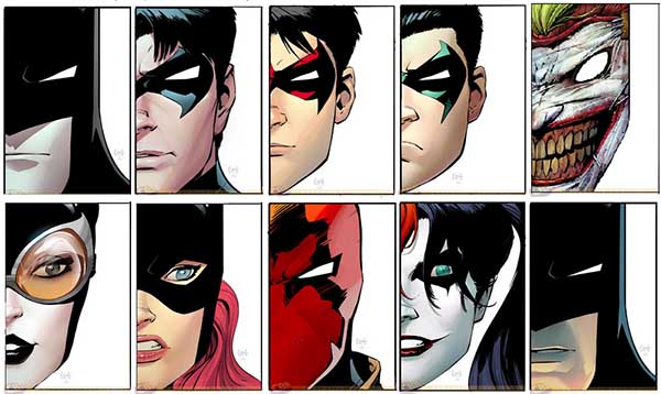
Last year there were handfuls of bad covers, but nothing as bad as some of the doozies on this list. Yes, we’ve gone downhill this year with how bad these covers get and couldn’t even surpass the Worst Comic Book Covers of 2010. Oh boy. But they are few and far between the numerous fantastic covers we’ve had this year.11. Detective Comics #15: There were nine “Death of the Family” comics that had basic die-cut covers: Batman #13, Batgirl #13, Catwoman #13, Suicide Squad #14, Detective Comics #15, Batman & Robin #15, Nightwing #15, Red Hood & The Outlaws #15, and Teen Titans #15.The picture above has ten die-cut images because the Joker mask shown went over every cover and was not its own issue (Detective Comics #15 is the one in the bottom right-hand corner). None of these covers are drawn terribly, but the theme leaves little to the imagination and every one of these had a Joker mask covering it, so they all look exactly the same at first glance. Also, these covers pale in comparison to the other “Death of the Family” covers, which were all fantastic and could have made up a Best Covers of 2012 list all on their on. But I particularly picked Detective Comics #15 because it is the same exact cover as Batman #13 except Batman has apparently gotten a tan over the course of “Death of the Family.”
10. Supreme #63: The man’s smile may be suitably maniacal, but the rest of the cover is ruined by an obsessive use of lines. The background mimics that of a speed lined action panel from a Robert Liefeld comic book and our fellow comic book reader has a bunch of lines creepy in his hair, on his clothes and taking over his forehead. Run before the lines consume you!
9. Cavewoman: Feeding Grounds #2: Cavewoman’s gaping mouth draws more attention than the creature’s. Her expression is goofy and it looks like she needs to eat more if those ribs are any indication. The rest of the cover is so bright it ruins the dangerous tone the title is trying to have since this woman is about to fall into a creature’s mouth. The bear also ceases to be scary when you notice the creature’s non-threatening golden skin.
8. Catwoman #0: Now, I could put all of the zero issues on here because they just mimic the first issue of every series cover and drain all the colors from the background. There is no creativity and it just shows how we didn’t need zero issues for origins because the New 52 #1’s were created to do just that. But I chose Catwoman specifically because of her compromising position. She’s drawn diagonally and looks like she’s trying to maneuver towards the reader. Maybe they’re trying to show how flexible she is…? Personally my spine hurts just looking at her. Thankfully the creators chose not to go with the original cover of this (on the right). It is even worse than the final cover, with a background drained reduced to a dull and lifeless grey that matches Catwoman’s grey-colored suit. Catwoman is also scrunched up almost into a ball and has boobs as big as her butt. And I’m not alone in this analysis. This cover has created a tirade of criticism and many have even, in retaliation, created their own parody covers. Catwoman #0 would have been the number one worst cover, but the creators saved themselves by changing it from the original into a more generic, but nonetheless bad, cover.
7. The Manhattan Projects #2: I’ve seen this series covers on the best lists and can’t fathom why. Each cover is simple, which doesn’t always have to be a crime if there is a lot of creativity behind it, but I’m not getting that here. It’s a symbol on each cover, and this is the dullest of the bunch. At first I liked how it introduces the concept by having the summary on the cover, but isn’t a picture supposed to say a thousand words? At least have an eye-catching background.
6. Defenders: Strange Heroes: The standard group shot has never gone so wrong with poor character designs all around and no attempt at creativity; just the obligatory group shot with a boring white backdrop. Red She-Hulk is positioned in such a way that it looks like she’s pulling out her hair and many other faces share a scrunched look. The official handbook for The Defenders is definitely not a good introduction to the characters.
5.Savage Hawkman #10: Rob Liefeld’s cover art often misses its mark. His series Grifter, Deathstroke and Savage Hawkman all have some pretty bad covers, but this issue of Savage Hawkman has his worst cover of the year (well, maybe next to the original Deathstroke #13 cover). Hawkman has eyes that look like they’re surrounded by tar and appears to be in an uncomfortable crouching position. He also has an over lined face reflecting off his visor and has a lot of odd crisscrossing lines across his body. This is a feral Hawkman. Then there’s the tagline: “Thirsty for blood.” I think my thirst is quenched.
4. Irresistible #2: Very tasteful Zenescope. Zenescope covers are meant to get men hot with a not-so-clothed woman on the covers… This cover, meant to allure male fans, has a guy pissing at a urinal. Can you guess why this comic book cover isn’t irresistible?
3. Smallville: Season 11 #24: Lex has a freakish expression on his face and his skin looks like he has an off sheen to it, thanks to the color scheme. Also, I know these are digital comics but why have the same cover for three issues? Now we get to suffer one of the worst covers of the year three times. That’s just laziness. Virtual dollars are being spent the same way as real dollars, and comic fans deserve what they would normally get on the printed shelves. This seems to be a trend in digital comics, at least based on TV shows, because Arrow covers do the same thing.
2. War Goddess #4: This cover just offends me. No, not because of the woman’s boobs jutting out (with one nipple looking like it could puncture a body just as easily as those spikes). No, it’s not the decapitated heads on sticks which people could find offensive if you’re not a horror hound. But even horror hounds could be offended by the young child getting plunged on a spike, not through just his head but through his privates. That is sickening.
1. Storm Rider #1: Never heard of Storm Rider? Neither had I until I saw this demented cover. The man’s opened-mouth hysteria is more terrible than funny with a lot of weird shading, but I bust out laughing every time I see that woman’s terrifying grimace. But don’t let her bulging eyes and clenched teeth distract you from the travesty that is her body. The excessive shading combined with an oddly proportioned body where I can’t tell where the torso stops and the pelvis begins makes this the worst cover of 2012.
This list has had some of the worst covers I’ve talked about so far in my yearly “Worst of’s” lists… which isn’t really saying too much since I only started them back in 2010. Are there covers worse than this? I don’t know, but I’m going to go searching for them! I hope you have enjoyed this year’s worst covers.Don’t get my bitterness towards comic book covers? Take a look at My Problems with Comic Book Covers.And if there was a cover that I missed which got your blood boiling, let me know!
An all-around nerdette, I’m a comic book connoisseur, horror aficionado, video game addict, anime enthusiast and an aspiring novelist/comic book writer. I am the head of the comic book department and the editor-in-chief of Entertainment Fuse. I also write and edit articles for Comic Frontline. I am also an intern at Action Lab Entertainment, a comic book publisher at which I edit comic book scripts, help work on images in solicitations and help with other comic book related project. My own personal website is comicmaven.com.
 10. Supreme #63: The man’s smile may be suitably maniacal, but the rest of the cover is ruined by an obsessive use of lines. The background mimics that of a speed lined action panel from a Robert Liefeld comic book and our fellow comic book reader has a bunch of lines creepy in his hair, on his clothes and taking over his forehead. Run before the lines consume you!
 9. Cavewoman: Feeding Grounds #2: Cavewoman’s gaping mouth draws more attention than the creature’s. Her expression is goofy and it looks like she needs to eat more if those ribs are any indication. The rest of the cover is so bright it ruins the dangerous tone the title is trying to have since this woman is about to fall into a creature’s mouth. The bear also ceases to be scary when you notice the creature’s non-threatening golden skin.
 8. Catwoman #0: Now, I could put all of the zero issues on here because they just mimic the first issue of every series cover and drain all the colors from the background. There is no creativity and it just shows how we didn’t need zero issues for origins because the New 52 #1’s were created to do just that. But I chose Catwoman specifically because of her compromising position. She’s drawn diagonally and looks like she’s trying to maneuver towards the reader. Maybe they’re trying to show how flexible she is…? Personally my spine hurts just looking at her. Thankfully the creators chose not to go with the original cover of this (on the right). It is even worse than the final cover, with a background drained reduced to a dull and lifeless grey that matches Catwoman’s grey-colored suit. Catwoman is also scrunched up almost into a ball and has boobs as big as her butt. And I’m not alone in this analysis. This cover has created a tirade of criticism and many have even, in retaliation, created their own parody covers. Catwoman #0 would have been the number one worst cover, but the creators saved themselves by changing it from the original into a more generic, but nonetheless bad, cover.
 7. The Manhattan Projects #2: I’ve seen this series covers on the best lists and can’t fathom why. Each cover is simple, which doesn’t always have to be a crime if there is a lot of creativity behind it, but I’m not getting that here. It’s a symbol on each cover, and this is the dullest of the bunch. At first I liked how it introduces the concept by having the summary on the cover, but isn’t a picture supposed to say a thousand words? At least have an eye-catching background.
 6. Defenders: Strange Heroes: The standard group shot has never gone so wrong with poor character designs all around and no attempt at creativity; just the obligatory group shot with a boring white backdrop. Red She-Hulk is positioned in such a way that it looks like she’s pulling out her hair and many other faces share a scrunched look. The official handbook for The Defenders is definitely not a good introduction to the characters.
 5. Savage Hawkman #10: Rob Liefeld’s cover art often misses its mark. His series Grifter, Deathstroke and Savage Hawkman all have some pretty bad covers, but this issue of Savage Hawkman has his worst cover of the year (well, maybe next to the original Deathstroke #13 cover). Hawkman has eyes that look like they’re surrounded by tar and appears to be in an uncomfortable crouching position. He also has an over lined face reflecting off his visor and has a lot of odd crisscrossing lines across his body. This is a feral Hawkman. Then there’s the tagline: “Thirsty for blood.” I think my thirst is quenched.
 4. Irresistible #2: Very tasteful Zenescope. Zenescope covers are meant to get men hot with a not-so-clothed woman on the covers… This cover, meant to allure male fans, has a guy pissing at a urinal. Can you guess why this comic book cover isn’t irresistible?
 3. Smallville: Season 11 #24: Lex has a freakish expression on his face and his skin looks like he has an off sheen to it, thanks to the color scheme. Also, I know these are digital comics but why have the same cover for three issues? Now we get to suffer one of the worst covers of the year three times. That’s just laziness. Virtual dollars are being spent the same way as real dollars, and comic fans deserve what they would normally get on the printed shelves. This seems to be a trend in digital comics, at least based on TV shows, because Arrow covers do the same thing.
 2. War Goddess #4: This cover just offends me. No, not because of the woman’s boobs jutting out (with one nipple looking like it could puncture a body just as easily as those spikes). No, it’s not the decapitated heads on sticks which people could find offensive if you’re not a horror hound. But even horror hounds could be offended by the young child getting plunged on a spike, not through just his head but through his privates. That is sickening.
 1. Storm Rider #1: Never heard of Storm Rider? Neither had I until I saw this demented cover. The man’s opened-mouth hysteria is more terrible than funny with a lot of weird shading, but I bust out laughing every time I see that woman’s terrifying grimace. But don’t let her bulging eyes and clenched teeth distract you from the travesty that is her body. The excessive shading combined with an oddly proportioned body where I can’t tell where the torso stops and the pelvis begins makes this the worst cover of 2012.
 This list has had some of the worst covers I’ve talked about so far in my yearly “Worst of’s” lists… which isn’t really saying too much since I only started them back in 2010. Are there covers worse than this? I don’t know, but I’m going to go searching for them! I hope you have enjoyed this year’s worst covers.
Don’t get my bitterness towards comic book covers? Take a look at My Problems with Comic Book Covers.
And if there was a cover that I missed which got your blood boiling, let me know!
This list has had some of the worst covers I’ve talked about so far in my yearly “Worst of’s” lists… which isn’t really saying too much since I only started them back in 2010. Are there covers worse than this? I don’t know, but I’m going to go searching for them! I hope you have enjoyed this year’s worst covers.
Don’t get my bitterness towards comic book covers? Take a look at My Problems with Comic Book Covers.
And if there was a cover that I missed which got your blood boiling, let me know!
