The economy of America has pretty much fallen to the floor, and echoes similarities to The Great Depression. With law enforcement as corrupt as the criminals they have sworn to protect, there is but one man left to look towards for hope, Wyatt Earp.
This is the backdrop for Radical's latest series “Saints for Sinners” ( a futuristic re-imagining of the western legend Wyatt Earp) . Created by Matt Cirulnick and David Manpearl. Written by M. Zachary Sherman (Shrapnel Aristeia Rising), color done by Kyushik Shin (worked as art director for Activision and Sony Online Entertainment) and illustrated by Mack Chater, Martin Montiel (The Darkness) and Colin Lorimer, an action comic filled with back-tracking that reads like a movie.
The story starts with Morgan Earp tied to a chair and bloody, shows his escape and his race to get to his brother the famous retired law enforcer Wyatt Earp. The narrative then back-tracks and shows Wyatt in his early crime-fighting days as he describes his history. His rise in fame, the death of a brother and his eventual retirement as he sees he can no longer keep up with the intense life.
I have not read any of Sherman's previous work to compare this to but I have to admit I was quite disappointed. The pacing is a large issue with this comic, it feels all over the place. A lot of the issue is told in flashbacks explaining how events came to be, but then will show another flashback to show how those events happened. It reminds me a little of Memento, but more confusing. Even when introducing some characters, low and behold, another flashback. Now this isn’t always the case as there are things shown in the “present time” but with this many flashbacks it is quite easy to become confused and overwhelmed.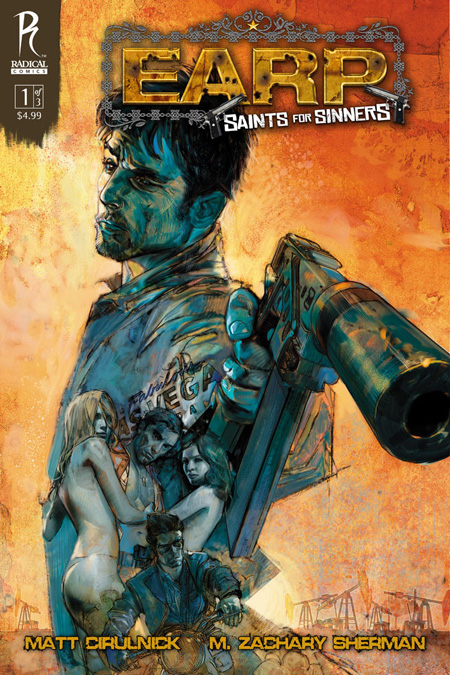
Another downside with this comic is the shallowness of characters and a failing plot. It is a struggle to feel for the characters in this comic, main and supporting. Dialogue is a let down as well. The plot feels oversaturated with content and too much thrown together all at once.
The artwork is another problem. It looks rushed and messy, backgrounds are blurry and just are not pleasant to look at. The coloring also looks rushed and blotchy. I'm sure this is an intended look maybe to seem a little gritty, but it really does not work for me. Alex Maleev was brought in for artwork for the cover. His heavy sketched looking artwork that is similar to that used in Scarlet, it does not impress.
All in all I was quite disappointed with this comic. It certainly did not stand out compared to other things I have read. It is one though that I will continue having read the first of three but it is not one that I really recommend, you are not missing out avoiding this one. Though an adaptation of an already existing story, it just did not work well.
Story: 4.0
Illustration: 3.5
Colors: 3.0
Cover: 3.5
Total: 3.5
