Though nobody expects a great movie poster to directly translate to ticket sales or one of poor quality to drive away every last patron, the care taken in a film's promotional campaign speaks volumes to the potential of the movie itself. Though this list shows that these streams do not always run parallel, there is a definite trend. The year is almost through and all posters unveiled to us (and though some great ones like those for Drive, Midnight in Paris and Albert Nobbs didn’t quite make the cut) let’s rack ‘em up and see who takes the top and bottom prizes for 2011 movie posters.
Ten Best
10. Red Riding Hood
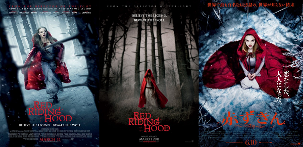
Right off the start we
have some striking posters for a movie that for most of the year was my most
despised. The first of the series in particular is extremely well constructed
with a great depth of field, vivid color palate and great use of angles. Shame
I wanted to run myself into one of those thorns upon watching.
9. 
8. Hobo with a Shotgun
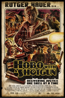
Like the posters for Grindhouse and Machete, the poster for Hobo with a Shotgun is pure blissful pulp from the wacky mind of Tom Hodge who has a number of great posters for indie flicks to his name. With the fold marks across the image and a great tagline, this is one poster you don’t want to mess with.
7. Winnie the Pooh
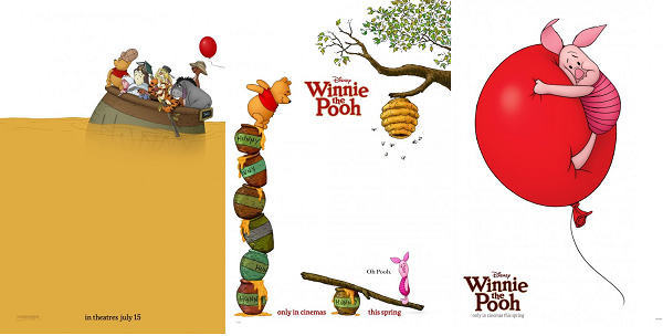
From visual anarchy to innocent simplicity, Winnie the Pooh’s posters are minimalist, vibrant and perfectly encapsulate the charm and nostalgia associated with that lovable bear.
6. Rise of the Planet of the Apes
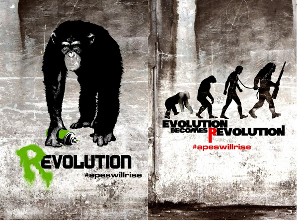
One of the biggest surprise hits of the year, these viral posters are Banksy-esque and endlessly clever (especially the play on Rudy Zallinger’s “March of Progress” image in the second poster). The hint of green in the ape’s eyes that matches the spray paint in the first screams foreboding events – revolution indeed.
5. The Adjustment Bureau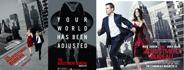
Pure Phillip K. Dick for The Adjustment Bureau’s promo artwork – obtuse angles galore, a dystopian color scheme and a sense of energy that makes these some of the year's best. The use of shadows in all three is particularly well realized.
4. Contagion
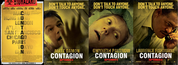
A few examples from the long string of posters for Steven Soderbergh’s Contagion, with the first implying a large scale epidemic and the latter three exuding a great sense of claustrophobic, germaphobic unrest (not to mention a sense of urgency).
3. Don’t Be Afraid of the Dark
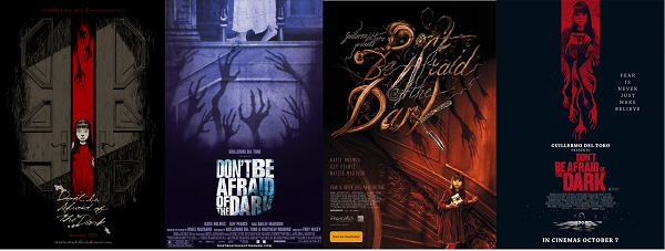
The most elegant of the bunch, all four of these posters expertly use the skeletal hand shadows and in the last, artfully integrates upward and downward reaching claws. So many posters seem to forget what can be done with an old fashioned thing known as a pencil – Photoshop is not the be all to end all.
2. The Muppets
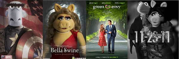
What more can be said about the entire marketing campaign for Disney’s The Muppets, it had clever fake trailers galore, oodles of posters that ranged from satire to traditional and even live television interviews with Mr. The Frog. The final image in the series would resonate with those so far from the target demographic. You have to give them points for pure audacity (and for helping me segue to the number one spot).
1. The Girl with the Dragon Tattoo
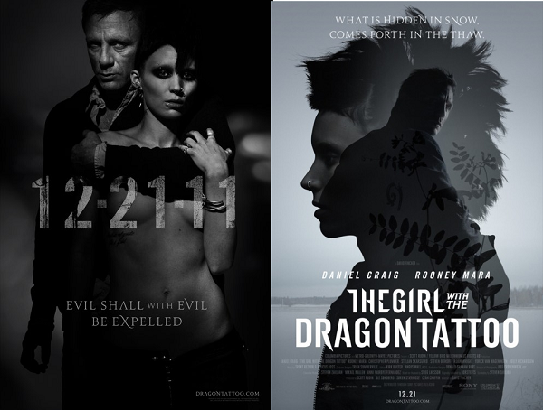
The early promo material for David Fincher’s “Dragon Tattoo” has been as bleak and gritty as the source material. The atypical trailer featuring an artful montage and a stellar cover of “The Immigrant Song” proclaims it to be “the feel bad movie of Christmas” and the posters certainly lean the same way. One version of the first poster bares Rooney Mara’s “goods” as it were, and all around is not your normally inviting ad. Simply put, you don’t see many posters like this each year.
H.M. The Cabin in the Woods
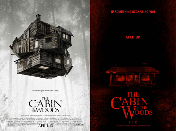
A bit of a cheat since this movie comes out next year, The Cabin in the Woods is still very much worth mentioning. The first featuring a rubix-cube-cabin seems to perfectly illustrate how this unique take on the genre will unfold and the second with the tagline “If something is chasing you…split up” is too awesome to ignore.
Ten Worst
10. Friends with Benefits

Solid film, flimsy poster. What the obsession is with just sticking your leads front and center, just staring out moronically at you, not doing anything, is beyond me (not to mention what little something they are doing doesn’t seem to have any ties to the plot of the movie or the situation the two find themselves in). There are no benefits to constructing your poster like this one.
9.
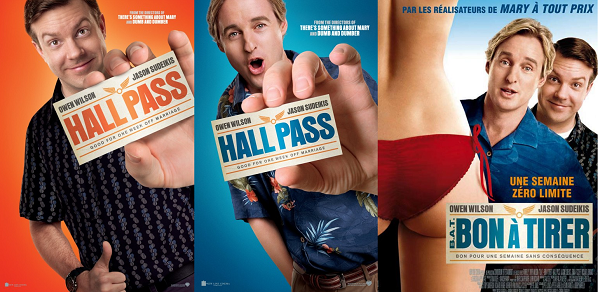
Nothing like a little awkward Photoshop and lazy, literal visual interpretations of the title to make a poster funny. There is nothing inspired about these posters and I’m still not sure exactly what expression Owen Wilson is making in the second frame. Perhaps he’s simply indicating that these posters blow.
8. 30 Minutes or Less
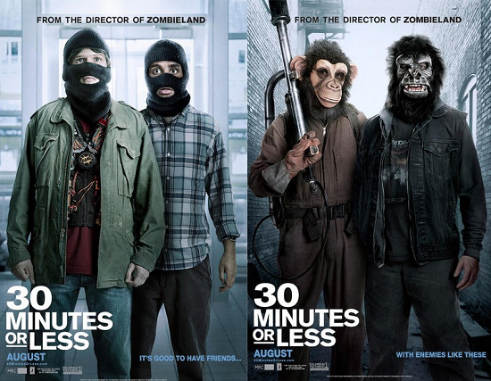
Another comedy, another blank stare (at least this time they have masks on – give the man a prize!). What about a pizza made with bomb parts, or something clever to do with time/30 minutes? These stagnant images promise nothing funny and only serve to bore you before you go into the sub-par movie itself.
7. Johnny English Reborn
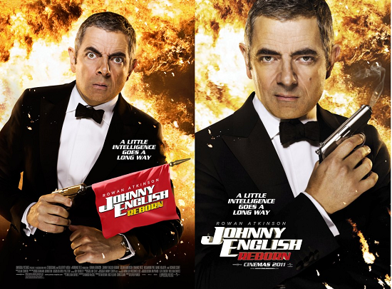
All the classic spy films that could be spoofed in a poster and this is what they go with? It becomes difficult to even lambaste these posters as there is so little going on, there is almost nothing to attack. The tagline reads “a little intelligence goes a long way”. So does a little creativity.
6. X-Men: First Class
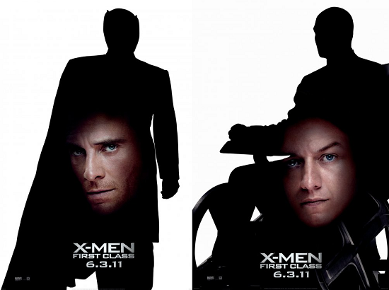
As far as misguided ideas are concerned, those for X-Men: First Class are in a class all its own. Matching quality to what a ten-year-old fiddling around with Microsoft Paint could turn out, these look like they were literally whipped up overnight. If the artists who conceived this posters weren’t reprimanded then there are worse things going on over at Fox than I thought.
5. Big Mommas: Like Father Like Son
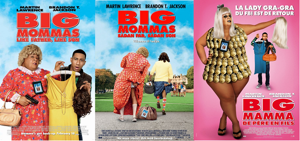
Umm, where to start with these fecal smears masquerading as posters. Maybe with the embarrassingly vacant stare of Brendon T. Jackson? The retina-melting melange of hideous colors? Or just the last poster in general. If anyone is able to tell me what the amorphous blob to the left is, I would be quite grateful.
4. Spy Kids: All the Time in the World
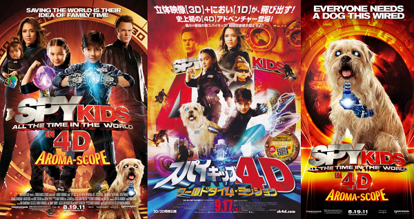
A dizzying affront to the
senses (and if you saw the movie, even your sniffer got a shot) if the aim was
to induce seizures, mission accomplished. There is so much going on in each,
and yet so much of nothing, I am
shocked Robert Rodriguez didn’t walk up to the Weinsteins and demand, on-the-spot,
they finance
3. The Dilemma
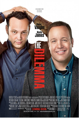
Easily the most boring poster of the year, this is one of the more rare instances where I believe the marketing push actually hurt instead of helped. I am clueless as to what the intentions were for this poster, but it appears they forgot they needed one and had an intern churn it out at 3 AM. You can practically see the cut and paste marks from the visual editing.
2. Zookeeper
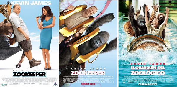
Am I crazy or did they use the same head of Kevin James for both the second and third poster? And let me riddle you this: in the first, why does James look so reluctant to be near Rosario Dawson? You wouldn’t have to shove me, that's for damn sure. All three of these posters are truly, truly horrendous, but judging on what people had to say about it, maybe it was intentional. Poor Kevin James.
1. Jack and Jill
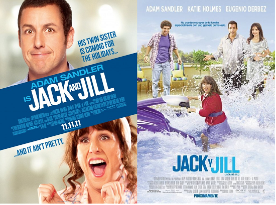
Poor Adam Sandler. I don’t feel bad for the man as much as I pity what his career has become and I really pity the team that though these posters were a good move for a film that was doomed from the brainstorming phase. The expressions of Jack and Jill in the first is so utterly grating I cannot bring myself to look at it for more than a few seconds, and the international poster, well, I can’t take my eyes off that train wreck. If you had a mentally-dysfunctional, amputee monkey button-mash in Photoshop (blindfolded) you would likely get a better result. Don’t send this one up the hill to fetch anything. Send it down the river.
H.M. The Human Centipede II (Full Sequence)
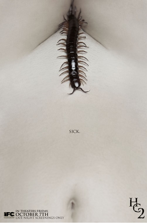
Tom Six is one sick man, and this poster isn’t so much bad (in fact it’s disturbingly artful) as it is... well, depraved, revolting and perverse; fits the movie like a glove.