Top Ten Worst Comic Book Covers of 2013
This year I’ve seen a couple of covers that would – unfortunately for them – make wonderful additions to this list. The pickings were still surprisingly slim this year, but here they are:
10. Love Stories (To Die For) #1 (Richard Bonk)
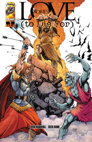
This feels like an Image Comics cover from the 90s. The background is neglected and the shadows under the baby are so distracting. The character's arms also make them look really stiff and their muscles have so many lines... maybe they're on the Robert Liefeld diet?
9. Batwoman #14 (JH Williams III)
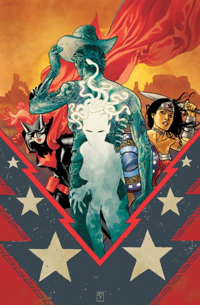
Usually,
Batwoman covers make my
best list and ironically JH Williams III usually has some wonderful covers, one of which made my best list for this year. But in this cover, while the colors may pop, Wonder Woman’s gritted teeth, eyes and posture make her look awkward and Batwoman has an odd sheen to her costume that makes her breasts look cone-shaped.
8. Fame: Drake #1 (Joe Phillips)
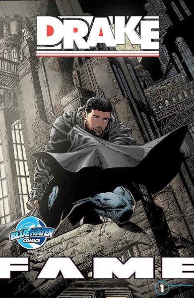
You know there’s a comic about everything when you have a comic book about Drake. Usually, Bluewater Production’s
Fame series gives us a standard, run-of-the-mill picture of the person they’re showcasing that looks like a typical photo-op. Here, we get a rip-off of
Batman #700 with way more lines than necessary.
7. Astonishing X-Men Annual #1 (David Williams)
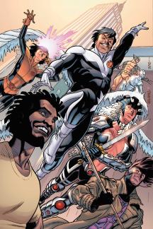
The expressions on Kyle and Northstar’s faces were enough to get this cover on the list. Kyle’s eyes are a dull grey and look like they’re about to bulge out of his eye sockets and he is covered in shadows. Northstar doesn’t even have pupils and his smug expression seems more malicious than playful.
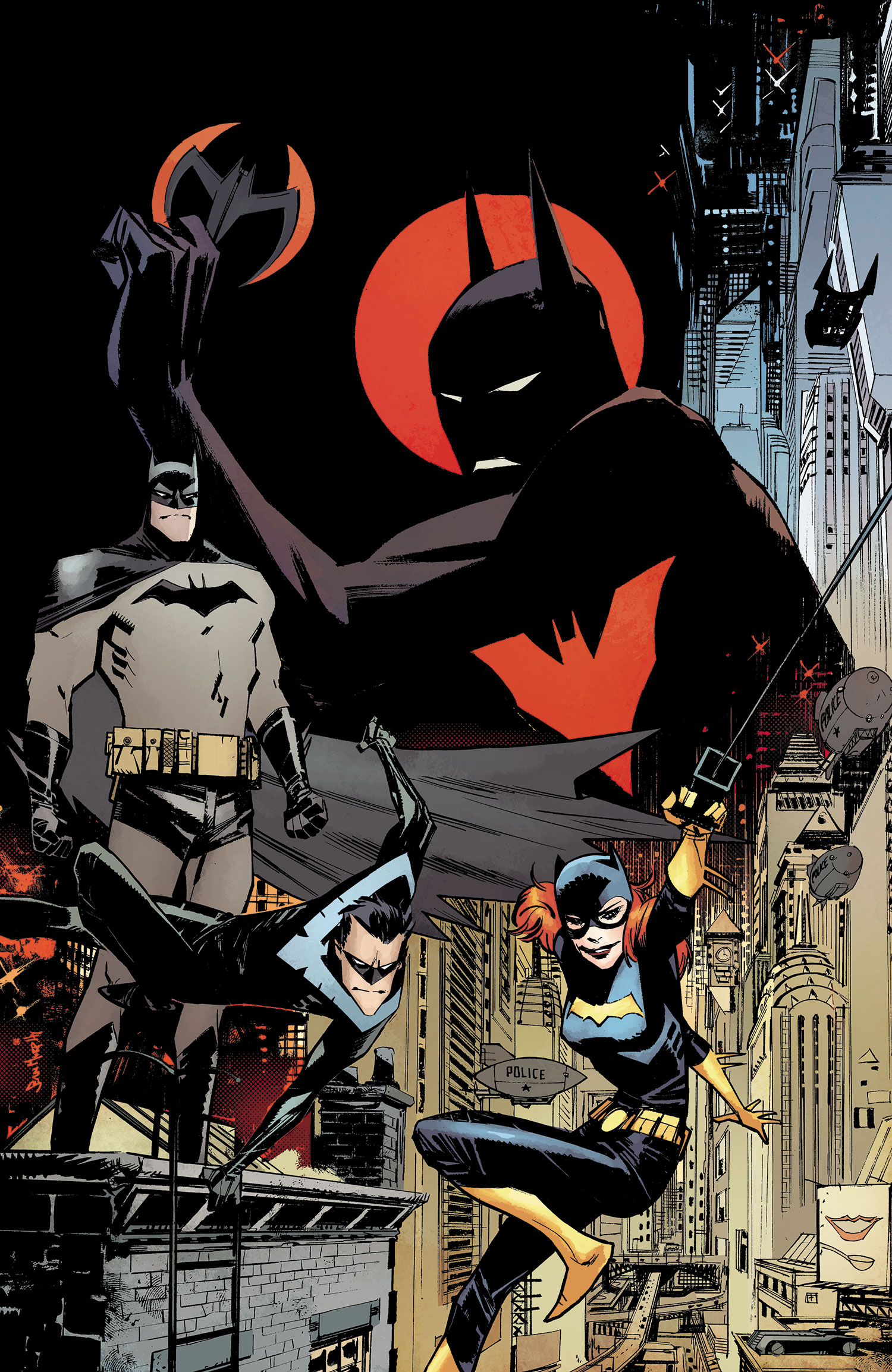
6. Batman Beyond Universe #1 (Sean Gordon Murphy)

Character’s faces are extremely awkward here. Nightwing’s chin looks like it could poke someone’s eye out. Then there’s the background. So much is crammed into half of the background with the cityscape and it’s juxtaposed awkwardly with the other half of the cover, which is simply a red circle and black background.
5. Red Lanterns #25 (Alessandro Vitti & Gabe Eltaeb)
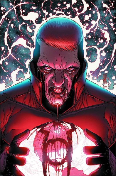
Red Lanterns has a bad habit of using blood in poor taste – and this is coming from someone who loves watching horror movies and playing bloody hack/slash video games like
Splatterhouse. The overuse of blood on Guy's face is just stupid and the numerous lines in his face does not a good character model make. I won't lie though, the one thing I do like about this cover is how the blood forms the Red Lantern's symbol on top of the world. Not very subtle symbolism though...
4. FF #1 (Mike Allred)
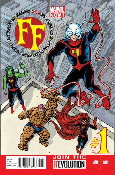
This would normally just be a standard group shot but no member of this team is drawn very well and their hand motions make them looks very stiff. The angle of the building also makes it look like Ms. Thing is lying on the roof instead of standing and the position of Medusa’s feet looks almost as awkward as the team’s salutes. This issue had three variants that were all superbly better. Any one of them deserved to be the main cover more than this one.
3. Legion of Super-Heroes #21 (Francis Portela)
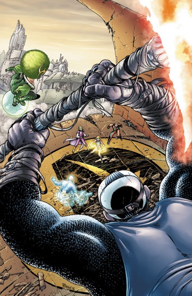
This cover has no focus. The only thing we really see is the back of a villain's head. Our heroes are almost specks in the distance, giving the cover artist an excuse to be lazy and not to give them any detail whatsoever.
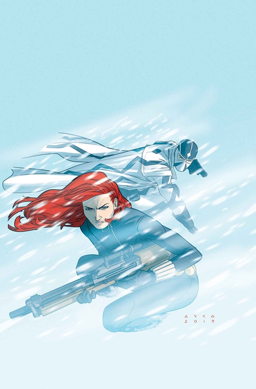
2. A + X #10 (Kris Anka)

Black Widow’s face is the most off-putting thing about this cover. I also like how the snow affects only the bottom half of the cover, leaving the top half of the cover a bland blue color. But that's when it doesn't have the
A + X logo strewn across the top. Even that logo doesn't improve this cover since it has two circles with characters having cartoony faces that don't mesh with Kris Anka's art.
1. Detective Comics #27 Frank Miller Variant
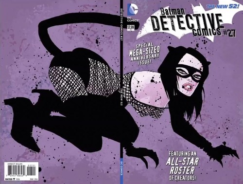
Thankfully this is the variant cover and not the standard cover. But this controversial cover by the notorious Frank Miller was almost pulled because it was so… Frank Miller. Catwoman is portrayed as a pole dancer who doesn’t even look like herself. Miller’s artwork leaves much to be desired. Catwoman’s hands look like pterodactyl claws, her eyes make her look demonic, her lips are so big it looks like she’s been stung by a bee and her teeth are clenched so hard they look like they’re about to break. It seems we can’t get through a year without
a controversial Catwoman cover on the list.
I hope you’ve enjoyed ridiculing some of the worst covers of 2013 with me. Keep in mind I'm just having some good fun with what
I think are bad covers. What do you guys think were the worst covers of 2013? Let me know in the comments below.