I would like to say that this book only gets better once you
get past the cover… but it doesn’t. In fact the cover is the best part of this
issue and I highly recommend you stare at it for two minutes without blinking
and then put it back. A weird thing about this book, is that at Wonder Con this weekend at the
Image booth they had clay molds of the characters heads… I don’t know why
because the art style isn't magnificent nor is it very complex.
The story starts off like a lot of bad detective stories do…
at the ending (or near the ending). A busty woman with red hair storms into
Private Investigator Roy Devine Jr.’s office to yell at him. From there we
rewind to the beginning of the story. It highlights red head Rachel’s laughable
movie career, her marriage to a guy that’s supposed to be Steven Seagle who's in deep with the Russian mafia. They apparently launder money for the mafia
with their b-movie productions.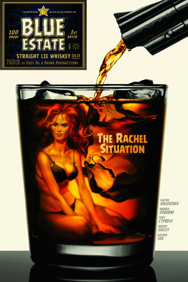 Really there isn’t much to this story. It’s more like a
timeline with pictures as it stops at key points in the line that are supposed
to give us background on these characters. Well it fails at that, but continues
any ways. The character development for Roy Devine Jr. is non-existent as he’s
barely in the issue and says nothing important when he is. He does narrate the
story though, giving the reader information that he would never be able to know
unless a villain took the time to reveal their master plan to him. Also even if Roy becomes developed I don't think I would care about him. He's comes across pretty annoying and that's saying a lot for how little he's in the book.
Really there isn’t much to this story. It’s more like a
timeline with pictures as it stops at key points in the line that are supposed
to give us background on these characters. Well it fails at that, but continues
any ways. The character development for Roy Devine Jr. is non-existent as he’s
barely in the issue and says nothing important when he is. He does narrate the
story though, giving the reader information that he would never be able to know
unless a villain took the time to reveal their master plan to him. Also even if Roy becomes developed I don't think I would care about him. He's comes across pretty annoying and that's saying a lot for how little he's in the book.
The writing in general was forgettable and left me wondering
why I had to read this entire boring pointless back story that could have been
summed up in two pages max. I didn’t need five pages about Rachael and Steven
Seagle Knock-Off’s movie career or their decline in popularity. Hell I’m pretty
sure I just re-wrote the issue and saved 12 pages right there. The point of the
story is completely lost on the reader since the writer Andrew Osborne never
finds it himself.
Perhaps the story is bad because it was original created by
head artist Viktor Kalvachev who created the series, did the layouts, designs
and covers. The art is the only tolerable aspect of this issue and even then it’s
basically trying to go for the same look as Chew but with its own
twist. This is a failed attempt however. Characters rarely have the same look twice
and the entire issue is just very inconsistent. If you can’t tell on your own I
will inform you that there is an art team on the book which contributes to the
struggling art style.
I really can’t recommend this book at all. I think that
there’s an audience for it out there, but it’s going to be few and far
in-between. People that do like it, I have a feeling will really like it and
find some mistaken brilliance where there is none. As for me this was a new
spin on a modern detective story without the spin. Don’t let the cool cover
fool you into making a mediocre purchase and try something else this week.
Overall Score – 4.0/10