I think issue 10 of The Manhattan Projects is, without a doubt, the best issue of the young series. I am sure there has been an underground comic or a web comic that has mined similar ideas, but Hickman is one of the most mainstream writers to base an entire issue on a mindscape.
Mindscapes are neither new to comics nor the visual medium in general. Think of Inception and the use of the safe to represent an idea the person is guarding. Think of X-Men whenever telepaths have ever battled. But rarely, if ever, is an entire issue take place within one. Then again, The Manhattan Projects are no ordinary type of comic.
There is a wonderful symmetry to nearly everything about this issue, including the title “Finite Oppenheimers” which references the first issue “Infinite Oppenheimers” and hints at a change in the status quo. The issue opens up with three pages reminding us of what happened in that first issue. Evil Oppenheimer consumes his brother. This may seem overly gruesome - terror porn. But it is just a reference to a philosopher (unfortunately Google is failing in helping me to identify him) who said that when we love someone we want them to be a part of us so badly that we desire to consume them that they might be within us. Evil Oppenheimer just happens to do this literally and it appears to work within the science fiction of The Manhattan Projects.
This issue allows us to look into Evil Oppenheimer’s mind to see what happened to Good Oppenheimer. Mindscapes in comics are often considered to be metaphors, but given the strange nature of the world in The Manhattan Projects it’s quite possible that it’s valid to view this place as a sort of pocket dimension which makes up Evil Oppenheimer’s mind.
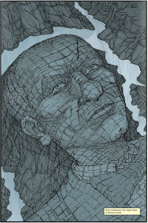
Early on in The Manhattan Projects the blue and red palettes held great importance in telling the story - signifying who was good and who was evil as well as shifts between the two. I’ve always felt this was one of the strongest artistic elements of the book. Recent issues have gone to a more traditional palette - perhaps signifying that everyone had gone on to morally grey ground, but I’m not 100% sure. The red/blue schema takes on exponentially more importance within this issue. Not only does it help identify the allegiances of the various characters we see within the issue, I would argue that it’s very important to pay attention to all the smallest details of the coloring. I really don’t want to give anything away, but there’s something even much more subtle, but also much more significant, going on than colors changing representing characters going good to evil or evil to good.
If you like a good comic book story, but LOVE a good comic book story that takes the comic book to an artform and truly uses everything unique about comics to tell a story then you will love this issue. It also makes a very good jumping on point. From the way it’s written and with the intro in the first few pages, you almost need to know nothing else about The Manhattan Projects to enjoy this issue. Get it next week, March 13!
