Best/Worst Comic Book Covers of February 2015
That’s right, another month has come and gone so it’s time for my monthly “Best/Worst Comic Book Covers” list. The last one seemed to go over well so I am continuing the tradition… for now. I also think it’s important to emphasize that I mean no disrespect when including covers under the worst list, nor do I think the artist of that particular cover doesn’t have worthwhile work. I just don’t think they did their best on that cover. I think it’s important to point out the best and the worst so we can admire what does work and learn from what doesn't.
There were so many awesome covers this month that I decided to include honorable mentions. This way none of these artists' covers would go unappreciated. So enjoy some of the awesome comic book covers February 2015 had to offer… and a few that were a lot less than awesome.
Best
5. ODY-C #3, Cover Art by Christian Ward
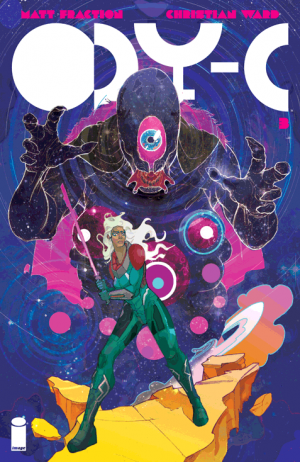
The use of classic shapes makes this a very abstract and appealing cover. I also like the array of colors. The blues, pinks and purples really give this cover a science-fiction feel. The character design is awesome. The figure looming above the unique white-haired warrior woman is an imposing figure. Its mouth adds to its creep factor.
4. Deep State #1 (Artyom Trakhanov)
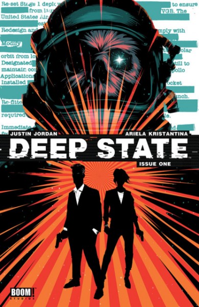
It’s impressive how this cover conveys two separate spaces and has them flow into each other so well. The flow of these images is helped by the space setting incorporated into each image: the astronaut garb and starry eyed look in the top half of the cover and the space and stars behinds the two agents in the bottom half of the cover.
3. Low #6 (Greg Tocchini)
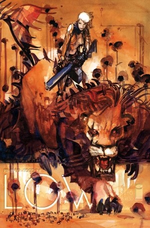
This cover looks like it was done in watercolors. This technique could have been taken in a very abstract direction but instead the artist manages to keep a lot of detail. I also like how the title is incorporated into the wall around the bullet holes. This is an ingenious way to avoid having the title take away from the effectiveness of the cover.
2. Alice Cooper #6 (David Mack)
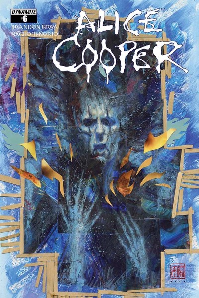
This cover is reminiscent of a psychedelic poster which I think perfectly embodies Alice Cooper.
1. Rat God #1 (Richard Corben)
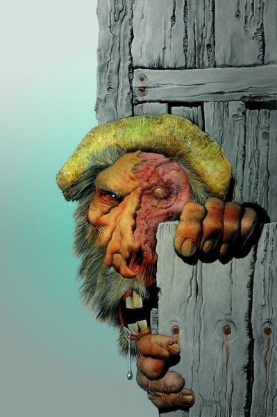
This cover takes me back to those old
Preacher covers. The level of detail is delightfully creepy with the scarred face, string of drool, yellowed teeth (of the few this man has), and pudgy fingers. The colors add to the realism of the picture.
Best Honorable Mentions
Rumble #3 (Dave Stewart)
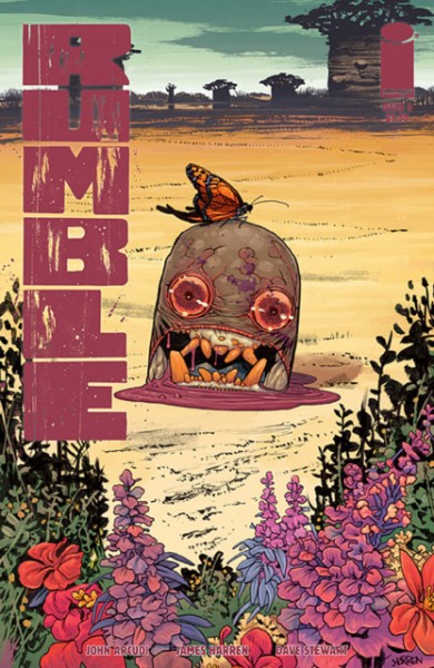
I enjoy the bright colors scattered throughout the garden. Plus that creepy headstone is creative and makes the reader wonder what is going on. This is a great cover that piques the readers’ interest.
Intersect #4 (Ray Fawkes)
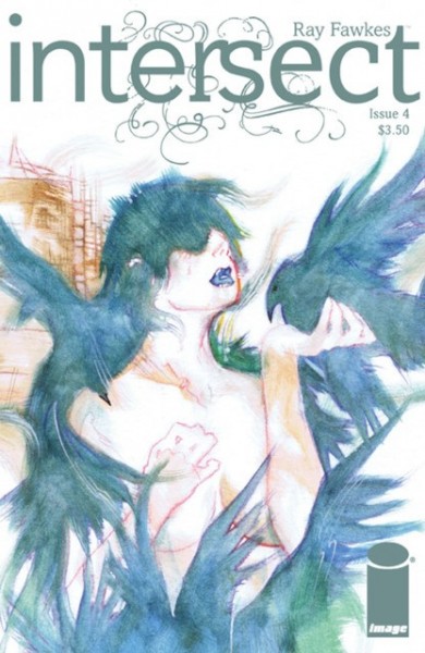
The design on this cover is intriguing. The painted look really adds to it. It's also impressive how this cover manages to stand out despite having a white background. Usually I find white backgrounds lazy but this one makes the cover stand out on the shelf.
Storm #8 (Stephanie Hans)
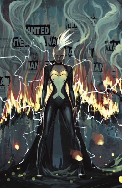
The painted colors really sell the chaos behind Storm. Plus Storm’s powerful stance make her feel like a force to be reckoned with. There's also a nice subtle touch of lightening coming from her fingers that expands all around her.
Defective Comics #1 (Darren Fitzpatrick)
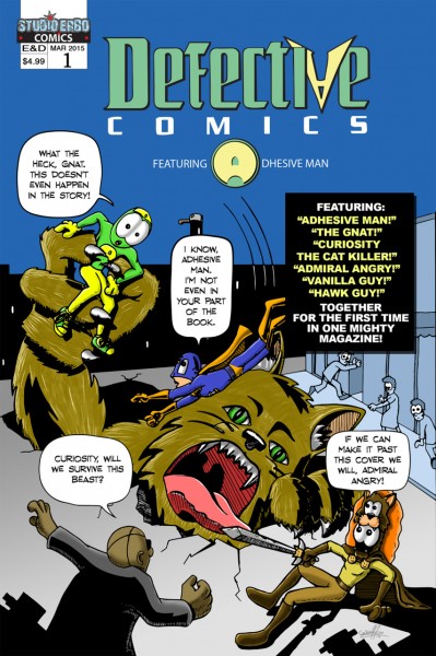
This is a fun cover that I enjoy but it didn't feel like it belonged on the best list. The artwork is paying homage to
Fantastic Four #1 which has been done a lot and the artwork isn't superb but I don't think it's trying to be. However, I like having another cover to add to my arsenal of images portraying the issues with comic book covers such as how they sometimes don’t portray what actually happens in the book and sometimes feature characters who don’t even appear in the same story together.
Worst
5. Psypher #1
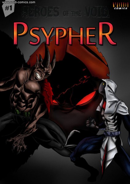
The background in this cover is so dull and it makes "Heroes of the Void" hard to read since it's a similar font. The demon on the left is standing awkwardly with his shoulder to his white hooded foe. The two look as if they're involved in a confrontation and I don't think leading with your shoulder is a recommended technique.
4. Deidre Dark’s Delightful Dolls #1
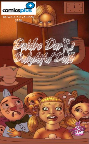
Based on the title it sounds like Deidre should be the creepiest person on this cover. But the dolls are drawn in such a way that they come off as somewhat creepy because of the way they're drawn while also being terrified. It also seems as if there are several different art styles going on among the dolls, from the female doll in the center to the wide eye (and mouthed) monkey in the near middle. There is also the tea set which is drawn very basically.
3. City War #6 (S.J. McCune)
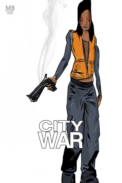
The woman's head on this cover looks slightly flattened. All of her proportions are a little off. This may be the artist's style but it still looks really awkward here. She also looks really bored.
2. Red Lanterns #39 (Scott Hepburn)
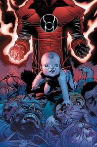
The artwork isn’t bad but… Is it just me, or is it disturbing to have a baby crawling on top of a bunch of maimed bodies? Anyone?
1. WWE Slam City #2 (Alitha Martinez)
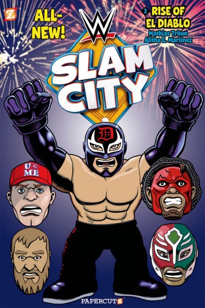
The center character isn’t the problem on this cover. It’s the four floating heads which put this cover on the worst list. These floating heads each have their own odd qualities. The man with the red mask looks like he is wearing a black hairnet and his clenched teeth make him look like he’s… uncomfortable. I don’t know what’s going on with the rest of the heads' teeth. The shock etched on each wrestler’s face is also a bit awkward. The background is rather bland.
Worst Honorable Mention
Secret Identities #1 (Ilias Kyriazis)
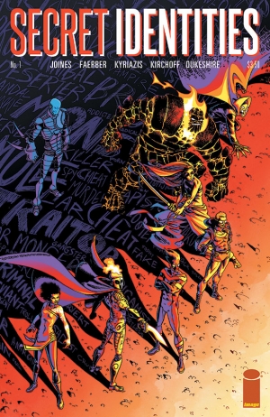
I thought this cover was so noteworthy that I mentioned it in
my review of Secret Identities #1. I actually like this cover. The artwork is good and I like how each character has words streaming behind them that describe them… however, this is where things get problematic. A big part of this issue is finding out these characters secrets and a lot of the surprise is ruined if you take the time to read the words trailing behind the characters. So, for the spoilers, this cover deserves a dishonorable mention.
You may have missed February, but if you comment below or send suggestions to
comicmaven.com then your pick for the best and/or worst comic book cover of March 2015 and your reasoning could be mentioned in next month’s list.
